
Wayfinding in aesthetic practices is about creating a smooth, stress-free experience for patients. Clear signs and visual cues ensure visitors can easily navigate your clinic, reducing confusion and delays. This not only improves patient comfort but also streamlines operations for your staff. Poor wayfinding can lead to frustration, late appointments, and a negative first impression - even if your treatments are excellent.
Here’s what matters most for effective wayfinding:
- Visual Hierarchy: Use large, easy-to-read fonts, high-contrast colors, and strategic sign placement to guide patients intuitively.
- Calming Design: Stick to clean layouts, professional fonts, and soothing colors like soft blues and greens.
- Accessibility: Include Braille, tactile elements, and high-contrast designs. Add multilingual signs if needed.
- Clear Layouts: Observe patient movement to identify bottlenecks and decision points. Create logical pathways with unobstructed sightlines.
- Digital Tools: Combine physical signs with digital aids like QR codes, interactive maps, and mobile-friendly navigation.
Testing your system with real patients ensures it works as intended. Adjust based on feedback to create a welcoming, efficient environment where patients feel at ease from the moment they arrive.
Core Principles of Wayfinding Design
Crafting an effective wayfinding system for aesthetic practices revolves around three key principles. These principles work together to create a smooth, stress-free navigation experience for patients, while also reflecting the professionalism of your practice.
Creating Visual Hierarchy
Visual hierarchy helps patients intuitively understand where to look first, second, and third. In aesthetic clinics, this means highlighting primary destinations like the reception area, treatment rooms, and restrooms, while secondary details take a backseat.
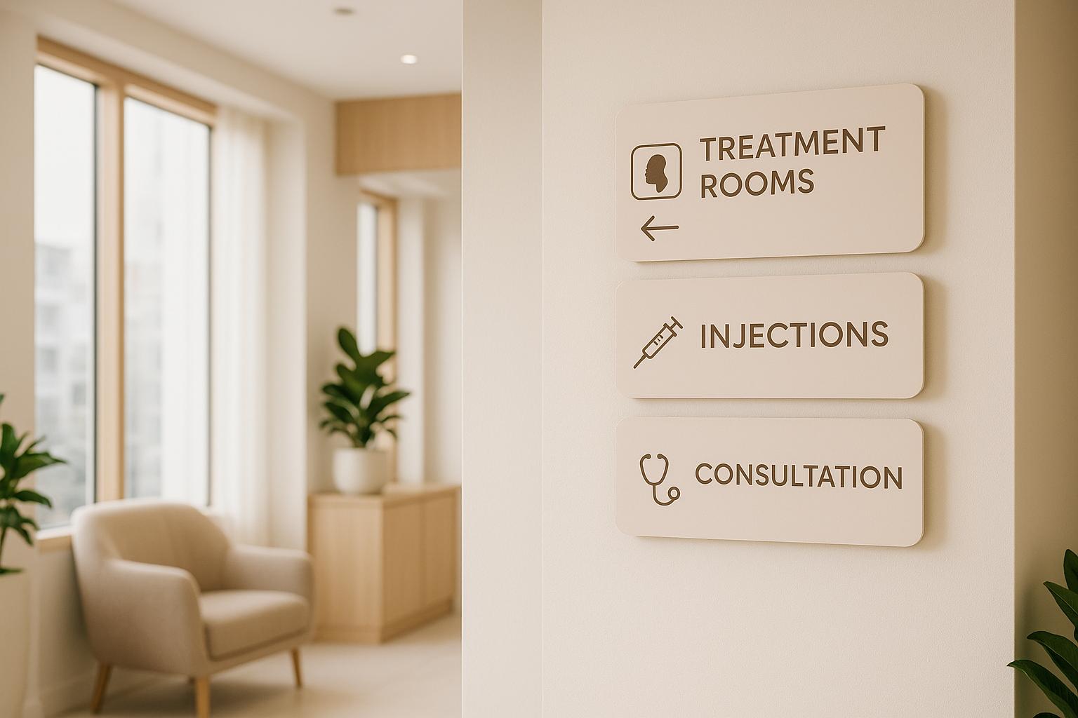
Start by prioritizing key signage with larger, easy-to-read fonts. Use bold, high-contrast colors - like dark text on a light background - to boost readability. Incorporate your brand's primary colors for essential information, while using neutral tones for less critical details.
Placement is equally important. Position directional signs at eye level for maximum visibility, ensuring they’re accessible to all patients, including those using mobility aids. Place these signs at decision points within your space, such as hallways or near entrances, to naturally guide patients to their destinations.
Choosing Calming and Professional Design Elements
Design choices go beyond aesthetics - they shape how patients feel in your space. A clean, uncluttered design communicates professionalism and creates a calming atmosphere. Avoid decorative fonts or overly busy layouts that can overwhelm or confuse.
Stick to modern, easy-to-read fonts like Helvetica, Arial, or Montserrat. These sans-serif options are clear and legible, making them ideal for wayfinding. Decorative or script fonts, while stylish, can compromise clarity and should be avoided.
Color selection also matters. Soft blues and greens promote calmness and trust, while warm neutral tones can create a spa-like, serene ambiance. Use bright, attention-grabbing colors sparingly, reserving them for urgent or critical information. Additionally, using high-quality materials like brushed aluminum or acrylic for signage can elevate the overall look and reinforce your practice’s premium feel.
Making Wayfinding Accessible to All Patients
Accessibility is essential for ensuring every patient can navigate your clinic with ease. Following accessibility guidelines not only helps patients with disabilities but also creates an inclusive environment for everyone.
Incorporate tactile elements like raised characters and Braille on room signs to assist visually impaired patients. Use high-contrast colors and glare-reducing finishes to improve readability under various lighting conditions.
If your patient base includes non-English speakers, consider translating key information into other commonly spoken languages. Alternatively, ensure staff are available to provide verbal assistance when needed.
Finally, position signs where they won’t be blocked by furniture, doors, or decor, and ensure they’re mounted at accessible heights. Use straightforward language, such as “Treatment Room 3,” instead of creative but potentially confusing names. Pair text with universally recognized icons to make navigation even faster and more intuitive.
Planning Your Wayfinding System Layout
Making wayfinding simple and effective starts with understanding how patients navigate your space. A carefully planned system can ease confusion, cut down on staff interruptions, and create a smoother experience from check-in to checkout. This process requires a mix of observation, strategy, and the use of both physical and digital tools.
Tracking Patient Movement Patterns
Start by mapping out the typical journey patients take through your clinic. Spend a few days observing their paths, noting where they pause, ask questions, or seem uncertain. These decision points are key spots where clear signage can make a big difference.
Pay close attention to busy times in your clinic, as these periods highlight the importance of clear navigation. Create a basic floor plan and use colored lines to trace the most common routes patients take. Mark areas where they tend to hesitate or appear lost - these are prime locations for improved signage to reduce staff redirection. Also, identify bottlenecks, such as around the reception desk or waiting areas, where congestion often occurs.
Keep in mind the different needs of your patients. First-time visitors may require more detailed guidance than returning patients who are already familiar with the layout. For new patients, clear and welcoming signage right at the entrance can set the tone for a positive experience.
Use these insights to design pathways that are straightforward and easy to follow.
Creating Clear Pathways and Sight Lines
Once you’ve identified how patients move through your space, focus on designing pathways that feel natural and intuitive. The goal is to guide patients with minimal need for additional signage. Remove any physical obstacles that block sight lines to key areas - this could mean rearranging furniture, moving plants, or repositioning decorative elements that obscure destinations like restrooms, treatment rooms, or checkout areas.
Create a logical flow for patient movement. A typical journey might go from the entrance to reception, then to the waiting area, treatment rooms, and finally to checkout. Avoid layouts that force patients to double back or cross paths unnecessarily.
Use architectural features like lighting or flooring to subtly guide movement. Additionally, ensure your layout meets ADA guidelines: corridors should be at least 36 inches wide, and doorways should have a clear width of at least 32 inches. This not only makes your space accessible but also helps maintain smooth patient flow.
Position high-traffic areas such as restrooms and waiting areas in spots that won’t interfere with treatment rooms. Treatment spaces should remain private and free from unnecessary disruptions.
Combining Digital and Physical Wayfinding Tools
To enhance navigation, combine physical signage with digital tools. This hybrid approach provides flexibility and caters to different patient preferences, ensuring a seamless experience.
For instance, digital check-in systems can display wayfinding maps. Platforms like Prospyr can show a simple map on a tablet or kiosk during check-in, helping patients locate treatment rooms or their next destination.
QR codes are another useful tool. Placing them on physical signs at key decision points allows patients to access digital maps or detailed directions on their smartphones. This is particularly helpful in larger or multi-floor facilities.
Digital displays in waiting areas can provide real-time updates on appointment status, room assignments, or navigation tips. Interactive directories near the entrance can help patients quickly understand the clinic’s layout, while mobile-friendly resources - like appointment confirmation texts with parking and entrance details - can prepare patients before they even arrive.
The key is to ensure that digital and physical systems work together. Permanent physical signs should convey essential information, while digital tools can handle more detailed or frequently changing updates. For example, if an appointment time changes in your scheduling system, the wayfinding information should update automatically across all platforms to maintain consistency.
Designing Clear Signage for Aesthetic Clinics
Good signage does more than just guide patients - it plays a key role in shaping your clinic's professional image. By focusing on thoughtful design, you can achieve a balance between functionality and visual appeal.
Choosing Fonts and Ensuring Readability
The font you choose has a direct impact on how easily patients can read your signs. Sans-serif fonts like Arial, Helvetica, or Calibri are excellent options for wayfinding because they stay clear and legible across various distances and lighting conditions. Steer clear of decorative or script fonts, as they may look stylish but often sacrifice readability.
Font size is another critical factor. Adjust it based on how far away the sign will be viewed to ensure clarity.
Equally important is contrast. Make sure there’s enough contrast between the text and background colors so the information remains easy to read, even in dim or bright lighting. Test your color combinations in different parts of your clinic to ensure consistency and visibility.
Finally, place signs at eye level and position them perpendicular to the flow of traffic to make them easier to spot and read.
Using Color to Reflect Your Brand
Color can do more than make your signage visually appealing - it can also reinforce your clinic’s identity. Consider using a color-coding system that aligns with your brand and helps with navigation. For instance, your main brand color could mark treatment areas, while complementary shades could highlight administrative zones. Neutral tones can work well for general amenities.
Colors should also contribute to a calming and professional environment. Soft blues, greens, or earth tones are excellent choices for aesthetic clinics, provided they contrast well with text. Keep in mind that colors can carry different meanings. For example, red often signals urgency, while blue tends to evoke feelings of trust and calm. Consistency across all signage ensures patients quickly adapt to your wayfinding system.
Incorporating Clear Symbols and Icons
Symbols can convey information faster than text and are particularly helpful for patients who may face language or reading barriers. Research supports the effectiveness of universal healthcare symbols for improving navigation.
That said, not all symbols are universally understood. Cultural contexts can significantly influence how symbols are interpreted. Studies suggest that a comprehension rate of 67% is a common benchmark for evaluating the effectiveness of graphical symbols. Icons for restrooms, elevators, exits, and parking are generally well-recognized.
For areas specific to aesthetic clinics, consider pairing universal symbols with straightforward text to eliminate confusion. For example, a bed icon might indicate treatment rooms, but adding a label like "Treatment Rooms" ensures clarity. Tailor your symbols to suit the demographics of your patient base, and if your clinic serves a diverse community, include multiple languages on key signs. Adding Braille or tactile lettering on permanent signage can also improve accessibility.
Before finalizing your signage system, test it with real patients. This step helps ensure that your design choices, from symbols to layouts, are practical and effective. By combining familiar icons with clear text, you can create a wayfinding system that’s easy for everyone to navigate.
sbb-itb-02f5876
Testing and Installing Your Wayfinding System
After all the planning and design work, the next step is to ensure your wayfinding system performs as intended. Testing it thoroughly before installation helps identify any flaws and ensures it meets the needs of its users.
Testing with Different Patient Groups
Testing your wayfinding system with actual patients provides insights you simply can’t get from theoretical planning. Start by recruiting volunteers from a variety of backgrounds - this could include first-time visitors, elderly individuals, those with limited mobility, or people with visual impairments.
Ask these volunteers to navigate your facility independently. Have them locate key areas like the reception desk, restrooms, and treatment rooms. Pay close attention to any moments of hesitation or confusion, as these may indicate unclear signage. You can also track how long it takes for them to reach their destinations. If they consistently take longer than expected, it’s a sign that adjustments are needed.
To dig deeper, follow up with short surveys asking about their experience. This feedback can highlight specific issues, such as unclear wording on signs or difficulties caused by poor lighting. These details are invaluable in fine-tuning your system.
Making Improvements Based on Patient Feedback
The patterns revealed during testing will guide your next steps. If patients consistently struggle to find elevators or emergency exits, for example, it’s time to reassess those signs. Focus on fixing the most pressing issues first - especially those that impact patient safety or cause significant delays.
Keep a record of the changes you make and the reasons behind them. Once adjustments are complete, retest the system with a new group of patients to ensure the updates improve navigation as intended.
Conclusion: Improving Patient Experience Through Better Wayfinding
A well-thought-out wayfinding system not only helps patients feel more at ease but also keeps appointments running smoothly.
Clear and organized signage sends a message of professionalism, which can enhance satisfaction and even encourage referrals. By making sure key areas - like the entrance, reception, waiting rooms, treatment spaces, and restrooms - are easy to find, you create an environment that feels welcoming and efficient.
The foundation of effective wayfinding lies in a few core principles: clear hierarchy, accessible design, a smart layout, and real-world testing. Take a moment to reassess your space. Watch where visitors pause or look confused, and pay attention to the questions your staff hears most often. These insights can highlight areas that need improvement. Fine-tuning these details can also have a positive ripple effect on your clinic's overall operations.
Even small, thoughtful changes can make a big impact. Pair these physical updates with digital tools for an even better experience. For instance, a platform like Prospyr can streamline patient communication and improve operational workflows, ensuring every interaction is as smooth as possible.
FAQs
How can I test my wayfinding system to make sure it works well for all patients, including those with disabilities?
To make sure your wayfinding system works well for everyone, including patients with disabilities, it's crucial to test it in real-world scenarios. Collaborate with individuals who have a variety of needs to pinpoint any obstacles and confirm the system is easy to navigate for all users.
Another useful step is collecting feedback through surveys or interviews. By involving a diverse group of users, you can fine-tune your wayfinding design to meet the needs of all patients, helping to create a space that feels welcoming and functional for everyone.
What should I avoid when creating wayfinding systems for aesthetic clinics?
When creating wayfinding systems for aesthetic clinics, there are some common mistakes you’ll want to sidestep. For starters, avoid designing signage that tries to connect every single location to every other one - it’s a recipe for confusion. Instead, focus on guiding patients along the most straightforward and essential routes. Stick to simple, clear language and steer away from technical or medical jargon that might overwhelm or confuse visitors.
Another misstep to avoid is cluttered or overly complex designs. Signage should be clean, easy to read, and inclusive for all patients, including those with visual impairments. Keep the design aligned with your clinic's overall look and feel to ensure a cohesive and inviting atmosphere. Clarity and simplicity are your best tools for creating a seamless experience.
How can digital tools work alongside physical signage to improve patient navigation and experience?
Digital tools can work hand-in-hand with physical signage to offer features like interactive maps, real-time updates, and personalized navigation assistance. These additions make it easier for patients to find their way, cut down on confusion, and even help reduce wait times. The result? A smoother, more stress-free experience.
For aesthetic and wellness clinics, using digital solutions such as touchscreens or mobile apps can make the entire process - from check-in to check-out - more accessible and supportive. When paired with clear physical signage, these tools create a seamless wayfinding system that puts patient comfort and ease at the forefront.

