
A full schedule can still hide weak performance. If you can’t see rebooking, no-shows, provider conversion, marketing ROI, and revenue by service, you can miss profit leaks even when your calendar looks packed.
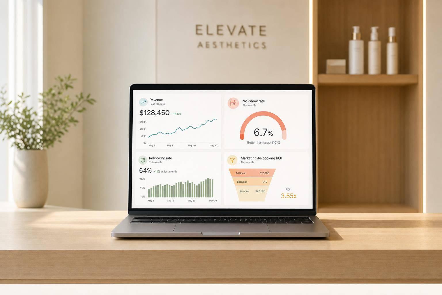
I’d sum it up like this: a KPI dashboard gives you one live view of the numbers that drive an aesthetic practice. That means you can track revenue, retention, patient flow, memberships, room use, and staff results without waiting for end-of-month spreadsheets. And that matters because disconnected systems can waste 10 to 15 hours per month per person, while admin mistakes often grow when teams jump between tools.
Here’s the short version:
- A busy schedule is not the same as a healthy practice
- Disconnected software leads to delays, errors, and blind spots
- Dashboards help you spot weak conversion, poor retention, and wasted ad spend early
- The most useful KPIs tie straight to revenue, margins, cash flow, and patient return rates
- Clear definitions and one shared data source matter as much as the dashboard itself
The article also points to a few benchmark ranges worth watching:
- Rebooking rate: 60%+
- No-show rate: under 11.2%
- LTV:CAC: 4:1 or higher
- Payroll as a share of revenue: under 40%
- COGS: 20% to 25%, with 35%+ putting margin under pressure
If I were explaining the core idea in one line, it would be this: a KPI dashboard helps you make better day-to-day decisions before small issues turn into lost revenue.
That’s what the rest of the article breaks down.
The Performance Problems KPI Dashboards Solve
Most aesthetic practices don’t have a patient problem. They have a visibility problem.
And when you can’t see performance clearly, it’s hard to judge what’s going on in real time. That’s why a packed calendar can still cover up weak performance.
Data Gaps Across Scheduling, Payments, and Clinical Records
When scheduling, EMR, CRM, and payment tools don’t connect, getting a clear view of revenue takes time and manual work. That friction adds up fast. Staff at aesthetic practices spend an average of 10 to 15 hours per month per person just moving between disconnected software systems.
The cost goes beyond lost time. Clinics using disconnected systems see up to 45% more no-shows and billing errors than clinics on unified platforms. And about 72% of administrative errors in healthcare settings come from staff switching between systems that don’t work together.
Without one dependable view, it becomes hard to track revenue by provider, service line, or location. And if the systems don’t line up, every other metric gets harder to trust.
Limited Visibility Into Profitability, Marketing, and Patient Retention
Even practices with strong appointment volume often can’t tell, in real time, which services make money, which campaigns lead to booked treatments, or which patients come back again and again.
That creates a chain reaction. Marketing spend stays broad instead of focusing on high-margin services. Rebooking rates go untracked, so weekly revenue starts to feel uneven. Then the only way to fill gaps is to spend more on new patient acquisition, which can get expensive fast.
The same issue shows up in advertising. If a practice tracks clicks or leads but not booked treatments, not just clicks or leads, a weak campaign can burn through budget for weeks before anyone catches it.
Management Decisions Based on Incomplete Data
Delayed reporting puts owners in reactive mode. Without real-time reporting, staffing, coaching, and expansion decisions often come down to gut feel instead of hard numbers.
Provider-level data matters here. Without it, it’s tough to tell the difference between a strong provider and a weak one. A practice-wide conversion average might look fine while one provider quietly underperforms for months.
The same blind spot affects growth decisions too. A full schedule can push an owner to hire too soon, when the real problem is no-shows or scheduling strategies, not limited capacity.
Those are the gaps KPI dashboards are built to close. Explore features to help grow your aesthetic practice and unify your data.
sbb-itb-02f5876
How KPI Dashboards Support Better Daily Decisions
Once your data is connected, the dashboard helps you see where action is needed.
One View for Revenue, Utilization, and Patient Flow
When a dashboard pulls data from scheduling, CRM, EMR, and payment systems, you get one clear view of how the practice is doing right now. You can check revenue, utilization rate, average case value, and how patients move through the practice without jumping between tools.
Utilization rate helps spot idle time caused by no-shows, booking gaps, and weak appointment flow. If patient flow data includes EMR records, use a HIPAA-compliant dashboard. That same screen can also show which marketing and retention numbers need work.
Smarter Decisions for Marketing, Rebooking, and Memberships
A lot of practices stop at clicks or leads from ad campaigns. But the number that matters most is cost per booked treatment. A dashboard makes that easy to see by tying ad spend straight to confirmed appointments. Without that link, a weak campaign can eat up budget for too long.
The same idea applies to retention. When rebooking rates, no-show trends, membership MRR, active member counts, and churn sit side by side, patterns stand out fast. A drop in rebooking rates can be an early warning that follow-up outreach needs work, long before it shows up as a revenue gap. Membership metrics help you see whether recurring revenue is holding steady.
Faster Staff Coaching and Course Corrections
Dashboard data also makes staff coaching more direct. Provider reviews get easier when provider-level results appear on one screen: conversion rates, revenue generated, average case value, and rebooking performance. That kind of detail turns coaching from vague advice into clear next steps.
For example, a front-desk team member can see that rebooking patients during the visit has a direct effect on the practice’s weekly revenue. That’s a lot more useful than general feedback.
Keep a close eye on consultation-to-treatment conversion. Small gains here can lead to much bigger revenue lifts. If one injector’s utilization rate starts to slip, that’s worth fixing early before it becomes a larger revenue issue. The whole point of the dashboard is to catch small problems while they’re still small. These decisions depend on tracking the right KPIs.
The KPIs Every Aesthetic Practice Dashboard Should Track

Aesthetic Practice KPI Benchmarks: Healthy vs. Warning vs. Crisis Thresholds
Once your dashboard is connected, the next move is simple: pick the few KPIs that have a direct tie to revenue, retention, and day-to-day performance. Not every number deserves the same weight. The point is to watch metrics that affect business results, not just numbers that look nice on a screen.
Revenue and Profitability KPIs
Start with revenue per provider hour. This is total revenue divided by all paid hours, including admin time and idle time. It gives you a straight view of how well each provider’s schedule is producing.
Role-based benchmarks vary:
- MD/DO injectors: $600–$800 per hour
- NPs: $450–$600 per hour
- Estheticians: $150–$250 per hour
If this number drops, the cause is often pretty clear: open schedule gaps, too much downtime, or a service mix that isn’t producing enough per hour.
You’ll also want to track average ticket value, which is the average spend per visit across services and retail. Put that next to revenue by service line, COGS %, and the retail-to-service ratio.
COGS % measures direct costs, like injectables and disposables, as a share of service revenue. A healthy range is 20% to 25%. Once it goes above 35%, margins are under pressure. The retail-to-service ratio helps show whether upselling is turning into actual dollars or just good intentions.
Patient Flow, Marketing, and Retention KPIs
On the growth side, track consultation-to-treatment conversion, lead-to-prospect conversion, expected booked revenue, and LTV:CAC. For profitable growth, the target is 4:1 or higher. For surgical procedures, high-performing practices often aim for a 30% to 50% consultation-to-surgery conversion rate.
For retention, watch rebooking rate and patient retention at 3, 6, and 12 months. The benchmark for rebooking is 60%+. That number matters because it shows whether patients are coming back on purpose, not by accident.
If your practice uses memberships, include:
- Active membership count
- MRR
- Churn rate
- Benefit usage
No-show rate belongs in this group too. Try to keep it below 11.2%. And if you want a fast pulse check on loyalty and word-of-mouth potential, CSAT and NPS can help.
Operational and Financial Health KPIs
After growth metrics, shift to the numbers that protect cash flow and keep capacity in check. This is where you make sure growth isn’t outpacing the business behind it.
Provider utilization shows how efficiently schedules are being used. Accounts receivable (AR) aging shows how long payments are sitting unpaid. Add payment mix and deferred revenue coverage so you can see whether cash on hand can support prepaid packages and memberships.
You should also track payroll as a percentage of revenue. The target is under 40%, while over 50% signals a serious problem. A weekly review helps you catch margin issues before they turn into a bigger mess.
Benchmarks will vary based on provider role and procedure mix, so use these numbers as dashboard guardrails, not fixed rules.
Use this table as a weekly benchmark guide.
| KPI | Healthy Range | Warning Zone | Crisis Threshold |
|---|---|---|---|
| Revenue per Provider Hour | $350–$425+ | $250–$349 | Under $250 |
| Rebooking Rate | 60%+ | 40–59% | Under 40% |
| LTV:CAC Ratio | 4:1 or higher | 2:1 to 3.9:1 | Under 2:1 |
| Average Ticket | $450–$600 | $300–$449 | Under $300 |
| Payroll as % of Revenue | Under 40% | 40–50% | Over 50% |
| COGS % | 20–25% | 26–35% | Over 35% |
| Deferred Revenue Ratio | Under 15% | 15–30% | Over 30% |
How to Set Up KPI Dashboards in Your Practice
Start With Clear Goals, Defined Terms, and Simple Dashboard Views
Once you know which KPIs matter, build your dashboard around the decisions those numbers need to support. A dashboard works when it turns scattered practice data into one clear view for action.
Start with 3 to 5 business goals that matter most right now, like increasing monthly revenue, improving provider utilization, reducing no-shows, or growing memberships. Then tie each goal to a small group of KPIs that show whether you're moving in the right direction.
Before you build anything, make sure the formulas are set. If people calculate KPIs in different ways, the dashboard turns into a source of debate instead of a source of answers. Shared definitions help teams stay aligned and make ownership clearer. It also helps to set up role-based dashboard views, so leadership, providers, and marketing each see the metrics they can actually act on.
Once the goals and metrics are locked in, the next step is getting clean data into one place.
Use an Integrated Platform to Cut Manual Reporting
After you define the KPIs, connect the systems that feed them. Research shows 51% of organizations say manual data entry hurts data accuracy and trust. When scheduling, payments, clinical records, memberships, and marketing all sit in separate tools, someone has to piece the data together by hand. That's usually where mistakes and delays start.
Bring scheduling, payments, memberships, lead capture, and analytics into one HIPAA-compliant system so reporting updates on its own. Prospyr (prospyrmed.com) pulls this data into one place. It combines scheduling, CRM/EMR, payments, lead capture, memberships, and practice analytics in one HIPAA-compliant platform, which helps keep the dashboard current.
Conclusion: KPI Dashboards Turn Practice Data Into Better Decisions
Aesthetic practices often run on instinct. A packed schedule can look like success, but the actual margin picture may say something else. KPI dashboards close that visibility gap by giving owners, administrators, and providers a shared, real-time view of what's happening across revenue, retention, utilization, and operations.
The right KPIs help teams make better decisions in the moment. That changes how the practice runs day to day. Instead of waiting on delayed, fragmented reports, the team gets one real-time view. With that view, practices can move faster on revenue, staffing, marketing, and retention.
FAQs
What KPIs should we track first?
Start with 8–12 core metrics that show financial health, day-to-day performance, and patient growth. If your practice is new, stick to the basics first: total revenue, lead volume, and appointment conversion rate.
As the practice grows, shift more attention to efficiency and profit. That usually means watching metrics like CAC, LTV, and revenue per hour. Prospyr can pull these into automated, real-time dashboards, so you can see what’s happening without digging through spreadsheets.
How often should we review dashboard metrics?
Modern dashboards give you real-time visibility into clinic performance. So instead of waiting for end-of-month reports, you can see what’s happening as it happens. That makes it much easier to track key metrics on a day-to-day basis and adjust marketing or staffing when needed.
For a more structured rhythm, review your KPI dashboard with your leadership team weekly. A regular check-in helps you spot weak metrics early and catch growth opportunities before they turn into bigger problems.
How do we make sure KPI data is accurate?
Cut manual data entry and keep your information in one integrated platform. When scheduling, billing, CRM, and inventory work together, you’re far less likely to end up with data silos or reports you can’t trust.
With Prospyr, data is recorded at the source and reporting is automated. That means fewer human mistakes and real-time, consistent metrics instead of scattered, pieced-together reports.